There are countless items to ponder when creating a thriving business. Some possible elements you prioritize are to whom do we advertise to, where should we spend our budget, and what people should we hire for the success of this company?
However, many businesses starting out forget one key component that can either make or break the image of the industry, literally, and that is the trademark sign.
When someone says “Google” or “Target”, the picture that comes to mind is the company’s logo, and not the employees or even the products. Therefore, it is important to get this critical part in advertisement correct, but with such a monumental task at hand, it’s hard to know exactly where to begin and how to accomplish this undertaking.
Thankfully, we at America’s Instant Signs have done the research and found the essential elements to consider when designing your outdoor business sign as well as the do’s and don’ts for absolute success.
THE MESSAGE

The general rule of thumb is that you have about 3 seconds to grab and keep the attention of a potential customer, especially when it comes to outdoor signage. Therefore, it’s essential to effectively get your point across as quickly and effectively as possible and yet still communicate your company’s purpose across to the audience.
Most people are either walking or driving on by, and usually are in a hurry about it too. You need to convey your message in as little words as possible to capture the attention of passer-byers. It is recommended to sit down and think about what your company is trying to convey or present, and then write it down.
Next, rewrite these goals using less and less words each time until you are satisfied with the content in no more than five words. A great example of this can be found in McDonald’s slogan “I’m lovin’ it”, which is the unlimited cultivation of their company’s aspirations towards their customers in all that they produce.
Once the Logo or slogan has been selected, it’s also important to find a way to convey the company’s industry type in a symbol. I know you want to be unique and stand out from other competitors, but believe me when I say the more cliché the better here. Using stereotypical images to present company values is an easy and fast way to communicate your business’s franchise.
There’s a reason why REI uses a pine tree and mountain scape façade on their logo or Bank of America showcases our nation’s flag: it’s because the symbol is appropriate to the product and easily recognizable by a majority of people. It wouldn’t make much sense if a bakery chose to display an apple instead of a cookie or cake icon. Go for the obvious here; it’s still possible to take an iconic symbol and make it uniquely your own without having to confuse your audience.
COLOR
Perhaps the most alluring element of a sign is the color, and therefore, choosing one or a couple shades over the thousands available is essential for success.
The first thing to consider is how color affects the audience. It’s known that colors have an emotional attachment, which is why you should figure out the sentimentality that you want your customers to feel or experience when simply looking at your sign.
Traditionally, white conveys a sense of strength and purity; blues give off an essence of tranquility, and yellow a presence of joy and happiness. Other colors, like red or green, can be used interchangeably depending on other elements and factors nearby. Red, for example, can emote love and affection but can also show sternness or violence depending on context and hue. Green can come off as either environmentally conscious or toxically repulsive according to tone and shade.
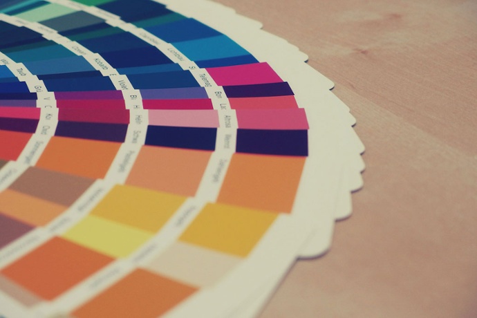
Colors also give off “temperatures”. Red, orange, and yellow are associated with heat while green, blue, and purple are connected with cold and thus can give the client a psychological presence of these temperatures. Consider how you want your viewer to feel. If you want them to approach your company with a sense of cool and comfort, try the “cold” colors, or go with the “hot” tones for a more vibrant and energetic aesthetic. Trampoline fitness company,Skyzone, uses orange as their key advertising color because it reflects the “get-up-and-go” attitude that the employees and business communicate.
In general, the key words when it comes to color are control and contrast. Have control by choosing one to three colors max in your advertisement. Too many colors, especially when combined unpleasantly, can be jarring and disorienting to your client and may turn them away. It can also be difficult to read with too much going on, therefore choose a small selection of colors that are contrasting. Color opposites, as found on the Color Wheel, can make your sign pop and stand out rather than fade into itself.
Also, consider your environment; the location of your sign can help determine colors as well. Don’t choose a color that is overused in your area or that blends into your building or background. Be bold in your color choices!
FONT
Fonts, like colors, also have an emotional reaction on your audience and can also be used to communicate company values or products much like a symbol or icon, so finding a good font is important for your sign.
All fonts fall into one of three categories:

Traditionally, most San Serif fonts display modernism because of its clarity and cleanliness in type, something more like script displays friendly connections, and serif fonts give a nod to classic and traditional aesthetics. Sit down and think about what you want to express and what is appropriate for the company’s image and usefulness. It doesn’t make sense to have a mortuary sign with crazy “circus” lettering or a kid’s afterschool program with a stern font. Make it fitting!
Go through samples and pick a few that display your industry’s “feel” or “emotion”. Also, stay away from branded fonts like Disney’s or Star Wars’ typefaces. They have an immediate reaction already associated with their look and will confuse or even appall your audience when seen on your business if you are not connected with that particular commerce.
Also, be mindful of size and legibility. There’s no use in having a sign if its viewers cannot read it. Therefore, be consistent in your fonts and choose only up to two typefaces. Be mindful that something that looks good on a small 8×11 sheet of paper may not display the same way on a building side because of letter boldness and design, and always consider the visibility distance when choosing font and size. Thinner and smaller fonts aren’t read as far as larger and more boldface letters. To see how big a sign should be for maximum visibility distance, check out the legibility chart by clicking the link here.
LOCATION
Finally, once the size, color, font, emotion, and icons have been chosen for your sign, the last element to think about is the signs location. Size, as described above, is not the only thing to consider when thinking about location, but also display height and other obstacles.
The easiest way to disregard a sign is to never see it; this may be because the sign is too high for viewers to see without much effort. Keep in mind that most potential clients are walking or driving, so place your logo where a wide range of people can view the emblem at eye level or from a major road.
Also, be aware of possible obstacles that could be in the way. Are there other buildings that could block the view? What about large trucks or trees? A sign should be visible no matter the time of day or the angle, which means the logo should stand out in direct sunlight, free of glares, or be illuminated during the night.
The best way to check for visibility is to simply act like a customer yourself. Go and take a walk outside your building or do a drive by throughout different points of the day to spot potential problems and map out the best location for placement.
DO’S AND DON’TS
In summary, here are the things to note when designing your outdoor business sign:
DO:
- Take the proper time to really consider all possible color, font, and size options. Your sign is the first impression of your company, so make it notable!
- Choose symbols that accurately, and even clichély, describe your company’s interests.
- Establish a consistent brand.
- Simplify
- Look at other successful business to see what elements are displayed in their logo for success.
- Play the role of the customer. By stepping into their shoes and being honest with your marketing, you can see what is and what is not working.
DON’T:
- Overcrowd or over color
- Forget about legibility
- Be afraid to take risks
- Underspend or skimp. The sign or logo is the number one marketing tool for companies, so spend a little. The sign will pay for itself if it attracts customers.

We understand how scary and challenging signage and branding can be, so we sincerely hope these tips were helpful and useful when it comes to your business logo. However, if you happen to have any more unanswered questions, please feel free to contact us at America’s Instant Signs for more design or installation questions. Our staff is highly trained in logo branding, so if you want expert guidance and helping hands when it comes to making your business blossom, let us know by giving us a call at 800-305-1105. We look forward to meeting you!
**Special thanks to Signs By Tomorrow for all the information mentioned in this article**