White walls have always been taken as a sacred, blank canvas. Such a color, or the lack thereof, often displays a sense of purity and simplicity, but in reality, the walls are screaming out for some much-needed desire and attention.
“Look at us!” they say, “We are the foundation and are anything but simple!” and therefore, as members who live under the comfort of walls, we must learn how to dress them in lavish style.
The Problem:
White is the “so-yesterday” shade to wear, and in a media crazed world, it’s easy to see why people are face down in a phone rather than a book. The key is color. The world is full of it and a phone is able to capture the shades that it reflects through Instagram, Tumblr, and Facebook, but stationary pages are doused in one boring tone: white, vanilla, bland. White is out and color is in.
How could we treat walls with such disrespect as to drape them in white? Such flippancy must be stopped, and what better way to take on the task than to tackle the problem at its core: in the classroom.
Take a look around any classroom… go ahead and look. What color dominates them all?
Yes, it’s white.
It may be because of budget cuts, fire codes, or pure lack of motivation, but the classroom, the place of all conventional wisdom and learning, is dressed with boredom. It’s no wonder students treat it like a prison, because it is represented in that same tone, but perhaps with an easy fix of homey color, attitudes can be changed, interests reinstated, and education feverishly pursued.
The Solution:
Recent studies have shown that color affects mood and therefore is a key element in personal growth both mentally and socially in students, so it is essential to find a color that is both pleasing to the eye and function of the mind but will also not be over stimulating, distracting, or even nauseating.
Hopefully, with a livelier classroom color, there will be more lively students, and nothing is worse than the undead in the classroom.
 (Source: Universal Pictures)
The Color Wheel and the Classroom:
 To bring students back from the educational dead, a more colorful environment is needed, but what colors to choose specifically?
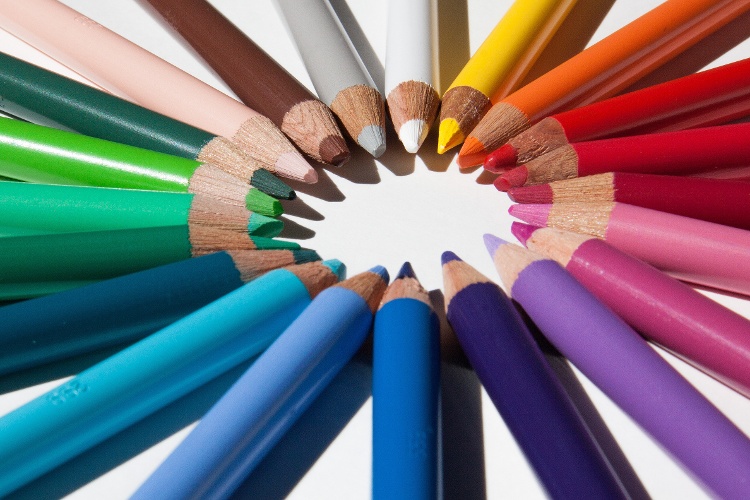
We all know of the classic, “Rainbow Order” of the color spectrum, but no one really knows why these colors are displayed in this pattern.
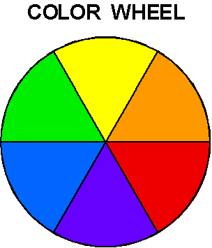
The Color Wheel, a visual map of color patterns, can help us study the relationships between colors, such as a pigment’s “friend” or “foe”:
- Friend: Colors lay next to, or are close to, other shades that work well with them (such as red paired with orange or yellow) creating a harmonious relationship.
- Foe: Colors usually clash with the hue on the directly opposite side of their position on the wheel (like purple and yellow). Although the clashes of colors are very eye catching, it is often a distraction in the learning environment because of its intensity. The color wheel can also help us in understanding mood.
The first three shades on the chart are red, orange, and yellow and collectively are known as the warm colors because of their bright and exciting concentration.
Warm colors give rise to high energy subjects and areas of more involvement, so choose these colors to highlight areas in the classroom that cater to physical movement and active membership like group activities, sciences or labs, and oral spelling.
Cool colors, such as greens, blues, and purples, are the last colors on the wheel and are said to be more calming and relaxed because of their subtlety. Use these colors to highlight areas of learning that relate more to concentration such as reading, writing, and math.
Extra Classroom Decor:
Signs may also play a key role in a classroom layout by defining goals for students.
Nothing says “Great Job” or “I’m Proud of YOU” like a personalized medal or plaque for students who have put forth the extra mile. Have an Awards Wall, filled with bright colors and patterns that catch the eye of faculty and classmates walking by that not only encourage them to do their best, but also display those who have done exceptionally well in the classroom.
Colorful banners, posters, and wall graphics also give added spice to the classroom by making an educational concept, like the parts of speech, more visual and fun.
Overall Layout: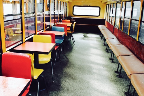
All colors may be present in the classroom, but for the major elements within the room, such as walls and furniture, stick to just a few key shades that work well together. Nothing is more distracting, or scary, than a jungle of chaotic color.
No one is going to focus with a monkey running wild in a room, and the some goes with crazy colors. Interior designer, Elizabeth Stout, recommends using multiple colors paired together to create an exciting environment that is still palpable and not diverting to the student or teacher, but be creative!
Try using a teal wall color with yellow chairs to keep a history lecture room focused with a side snap of fun and excitement, or use a soft lemon pallet with lime and wood-toned furniture to give a vibrant yet relaxed feel to theater class. Any combination that is chosen can always be spiced up with a little flare, so be bold, adventurous, and mindful of the students.
Any learning environment can feel like home with a little welcoming color.
For more help on classroom layout, color choices, and design, please contact us at America’s instant signs by calling 714-693-2989 or visit our contact page here for any other questions, comments, or feedback.